-
 +91 9819019003
 -


Munaafa Financial Services
AMFI Registered Mutual Fund Distributor


Munaafa Financial Services
AMFI Registered Mutual Fund Distributor

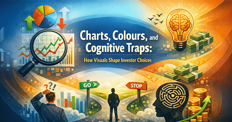
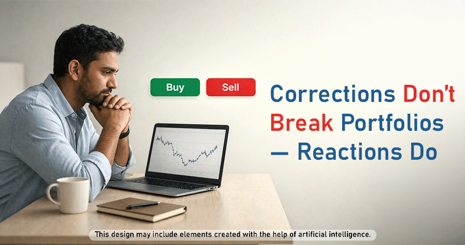
Charts, Colours, and Cognitive Traps: How Visuals Shape Investor Choices
Most investors believe their decisions are guided by logic, data, and long-term planning. They rely on numbers and assume emotions remain under control. Yet, confidence can shift even when there has been no meaningful change in underlying market fundamentals, raising an important question about what truly influences investor reactions.
Today, investing is often experienced through visual representations. Charts condense years of market movement into brief moments, colours signal gains or declines, and dashboards simplify complex information into easily digestible indicators. While these tools are designed to inform, they can also influence how risk and opportunity are perceived.
The key consideration is not whether visual tools are useful, but how strongly they can shape behaviour before deeper analysis begins. Investors may feel they are responding purely to data, when they may also be responding to presentations. Recognising this influence may encourage investors to approach decisions with greater awarness
The human brain is naturally inclined to process visual information more quickly than text or numerical data. Long before formal literacy or calculation, people relied on visual cues to assess safety and opportunity. This tendency continues today. Colours, shapes, and patterns are absorbed almost instantly, while reading data or analysing figures requires more deliberate effort.
In the context of investing, this creates a distinction between emotional and analytical responses. Visual cues often activate instinctive reactions—such as concern or enthusiasm—before rational evaluation takes place. Analytical thinking, which involves assessing context, comparing information, and understanding implications, typically follows at a slower pace. As a result, investors may experience an emotional response to market movements before fully understanding their significance.
This helps explain why initial market reactions are often emotional rather than analytical. A declining trend on a chart may appear alarming even when it reflects short-term fluctuations, while a rising pattern may seem reassuring despite increasing risk. Recognising this tendency can encourage investors to pause and reassess before acting to inform decisions before acting on initial impressions.
Colours often influence perception before numbers are consciously processed. Red is commonly associated with caution, loss, or warning, while green is linked to safety, progress, or positive outcomes. When investors see red on a screen, it can instinctively signal concern, whereas green may create a sense of reassurance. These reactions tend to be automatic and emotional rather than analytical.
Modern investing and trading platforms frequently use this colour contrast to present information clearly and capture attention. Gains are typically shown in green and declines in red, with even small movements made visually prominent. While this design can improve readability, it may also amplify emotional responses. A modest decline may feel more significant when displayed in bold red, and a short-term rise may appear more encouraging when highlighted in green.
Such visual presentation can create a sense of urgency. Frequent colour changes may suggest that constant action is required, even during routine market movements. As a result, investors may feel inclined to act quickly—by buying, selling, or checking portfolios repeatedly—without first assessing whether the situation truly calls for a change. Recognising this influence can help investors pause and evaluate information more thoughtfully before making decisions.
Charts are often viewed as objective and factual, yet they can also influence emotional responses. Short-term charts, in particular, highlight frequent price movements. Normal market volatility may appear more pronounced, which can lead to concern during temporary declines or overconfidence during brief upward movements. When attention is focused primarily on short-term fluctuations, emotional responses can begin to outweigh long-term reasoning.
The way a chart is presented can significantly shape perception. A zoomed-in view displays only recent data, limiting historical context and potentially making markets appear more unstable. A broader, zoomed-out view shows longer-term trends, where short-term movements may seem less pronounced. While the underlying data remains the same, the perspective changes.
As a result, the same information can convey very different impressions. A brief decline may appear concerning on a short-term chart but relatively minor when viewed over a longer timeframe. Investors may feel they are responding to factual information, when they may also be responding to presentation. Recognising this distinction can help investors pause, regain perspective, and base decisions on a more balanced understanding.
Dashboards are designed to make investing information easier to access and understand. They combine elements such as portfolio allocation, recent performance, and market movements into a single, simplified view. By presenting information in a consolidated format, dashboards can create a sense of clarity and control, making key details readily visible.
Challenges may arise from how frequently this information is reviewed. Regular visual monitoring exposes investors to short-term fluctuations, many of which may have limited relevance to long-term objectives. Repeated exposure to small movements, colour changes, or brief variations can trigger emotional responses over time, potentially increasing discomfort or impatience. Instead of offering reassurance, constant checking may make routine market movement feel more stressful.
Increased visibility can also contribute to impulsive decision-making. Frequent updates may create a sense that action is required, even when no change is necessary. The ease of access can make reacting feel productive, while remaining patient may feel counterintuitive. Over time, this pattern can draw investors away from disciplined, long-term thinking and towards decisions driven by short-term signals.
Visual representations in investing can reinforce behavioural biases that already exist in human decision-making. One commonly observed bias is loss aversion. When market declines are highlighted visually, particularly through prominent colours or symbols, even modest or temporary movements may feel more significant than they are. This can lead investors to place greater emphasis on avoiding short-term discomfort rather than staying focused on longer-term objectives.
Conversely, sustained positive visuals can contribute to overconfidence. Repeated upward patterns or favourable displays may create the impression that market movements are predictable or that recent outcomes reflect personal decision-making rather than broader market conditions. This perception can encourage higher risk-taking or reduce attention to potential downside factors.
Short-term visual trends may also amplify recency bias. When charts and dashboards emphasise recent performance, investors may place disproportionate weight on the latest movements, assuming current trends will continue. Over time, longer-term data and broader context can receive less attention. As a result, decisions may be influenced more by what is immediately visible than by what is most relevant for long-term planning.
Long-term investing typically involves patience, consistency, and a clear focus on objectives. Short-term visual cues, however, can work against this mindset. Daily charts, frequent performance updates, and constant visual changes highlight near-term movement, even though long-term goals are generally measured over extended periods. This contrast can create discomfort, even when an investor remains aligned with their broader plan.
A common challenge arises when routine market movement is mistaken for portfolio failure. Temporary declines may appear concerning on a screen, but they do not necessarily indicate that an investment approach is no longer appropriate. When investors place excessive emphasis on visual signals, short-term volatility may be interpreted as a problem rather than a normal feature of market behaviour.
Over time, repeated focus on short-term visuals can draw investors away from disciplined approaches. Emotional responses to frequent updates may lead to avoidable adjustments, pauses, or exits. Instead of following a structured process, decisions can begin to respond primarily to what is most visible. In this way, visual information can gradually weaken long-term discipline without investors consciously recognising the shift.
Visual information in itself is not inherently problematic; challenges arise when it is consumed without sufficient context. Charts can be more useful when viewed in alignment with an investor’s time horizon. For those with long-term objectives, broader time-frame charts that reflect multi-year trends may provide more meaningful perspective than daily or weekly views that tend to emphasise short-term noise.
Another consideration is the frequency of exposure to market visuals. Repeatedly checking charts or dashboards can increase emotional involvement without necessarily improving decision-making. Limiting how often portfolios are reviewed may help investors remain focused on their overall approach rather than reacting to short-term movements, allowing decisions to stay measured and deliberate.
It is also helpful to distinguish between observation and action. Not every visual change requires a response. Charts may be effective when used as tools for understanding and periodic review, rather than as prompts for immediate decisions. When treated in this way, visual information can support a more structured approach to reviewing information with long-term objectives.
Conclusion: From Reaction to Reflection
Visuals have become an integral part of the investing experience, though their influence is often subtle. Charts, colours, and dashboards can shape perception quickly, affecting emotions before analytical reasoning has time to engage. Being aware of this influence is important, as unexamined reactions to visual information may quietly guide decisions away from long-term objectives.
Taking time to pause before acting can create space for reflection. Not every market movement calls for a response, and not every visual signal represents a meaningful change. When investors slow down, consider broader context, and reconnect with their objectives, decisions may be less influenced by immediate visual reaction.
Ultimately, investing outcomes may be influenced less by what appears on a screen and more by how information is interpreted and managed. The aim is not to avoid visual tools, but to use them with perspective, patience, and discipline, while meaning mindful of long-term goals.
This content is for investor education only. This blog should not be treated as investment advice or a recommendation. Mutual Fund investments are subject to market risks, read all scheme related documents carefully.
Nilesh Gala is an AMFI Registered Mutual Funds Distributor and founder of Munaafa Financial Services (MFS). He has been in the field of Financial Services for over two decades, offering a wide array of products and services.

101, B Wing, Pride Enclave -
Apollo Building, Vishnu Nagar,
Thane West - 400602